
May 19, 2026
Customize page themes and layouts
PRO Plan users can customize how their Budolinks storefront looks and how shoppers browse products.
Themes and layout settings help create a cleaner, more branded storefront experience for your audience.
Step 1: Open Appearance settings
Go to:
- Profile Settings
- then open Appearance & organization
Here you can customize:
- page themes
- colors
- product layouts
- category browsing
- shop button styles
Step 2: Choose your page theme
Select a storefront theme that matches your creator style.
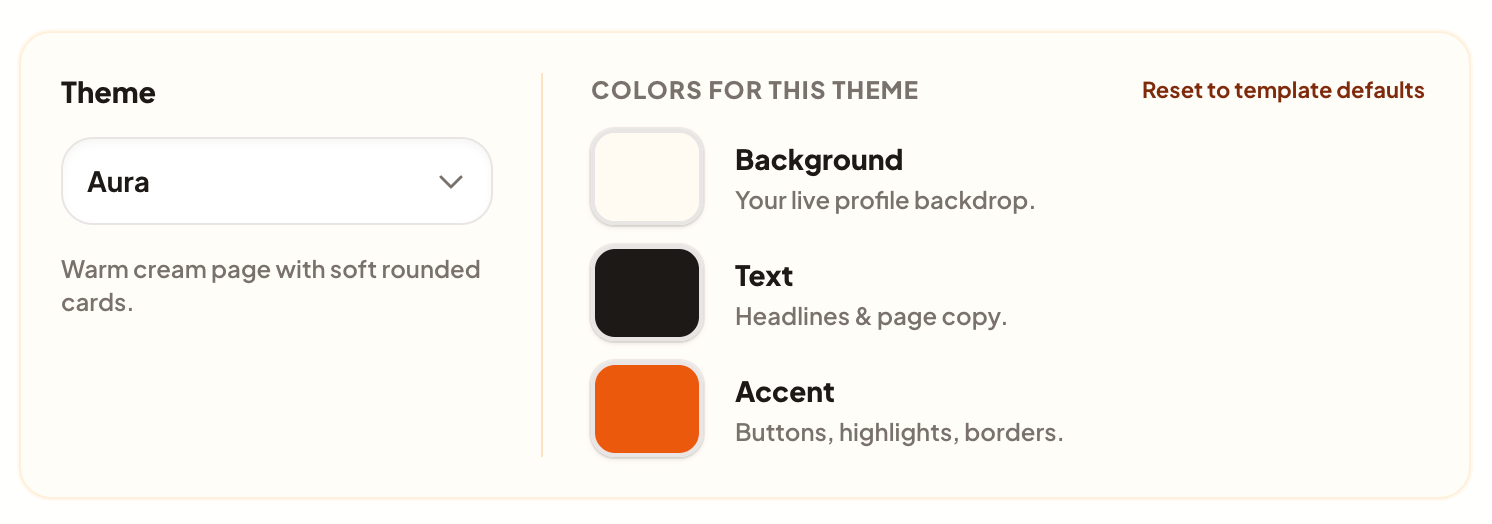
Available themes may include:
- Aura
- Slate (PRO)
- Studio (PRO)
- Flat (PRO)
- Signature (PRO)
- Storefront (PRO)
Themes control your storefront’s:
- background colors
- text colors
- accent colors
- overall visual feel
Step 3: Customize storefront colors
Each theme includes customizable colors for:
- Background
- Text
- Accent highlights
Accent colors are used for:
- buttons
- borders
- highlights
- theme accents
You can also reset colors back to the default theme settings anytime.
Step 4: Customize your product layout
Choose how products appear on your public storefront.

List layout
Displays products in a larger vertical layout that is easier to scan.
Best for:
- creator recommendations
- detailed product browsing
- mobile-friendly storefronts
Card layout
Displays products in compact grid cards.
Best for:
- image-focused storefronts
- larger product collections
- visual browsing
First link
Displays simple cta button that link to first link.
Useful for:
- quick conversion
- one link setup
Step 5: Customize category browsing
If your storefront uses categories, you can control how shoppers browse them.
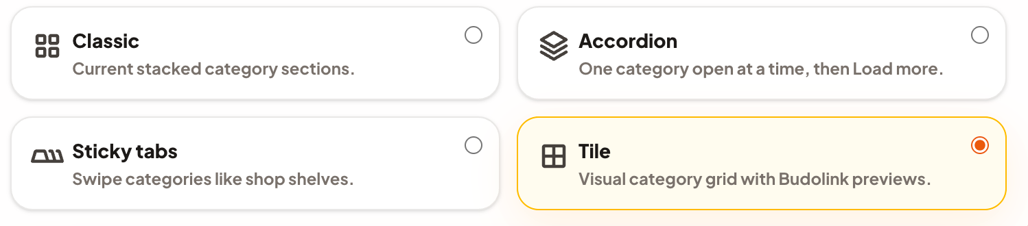
Classic
Traditional stacked category sections.
Accordion
Shows one category at a time with expandable sections.
Sticky tabs
Creates swipeable category tabs for faster browsing.
Tile
Visual category grid with Budolink previews.
Category layouts only appear when your storefront contains categories.
Step 6: Choose your shop button style
Control how marketplace buttons appear on product pages.

Show every shop button
Displays all available marketplace buttons directly on the page.
Useful for:
- showing multiple marketplaces
- comparing stores
- highlighting all buying options
One button + picker
Shows one main button that opens a popup shop selector.
Useful for:
- cleaner storefront layouts
- reducing visual clutter
- mobile browsing
Step 8: Save your changes
Click Save theme or Save listing layout to apply your storefront customization settings publicly.